Rheinische Post boosts conversion rate with a paywall page redesign
This article describes how the German publisher took its paywall page through several rounds of testing and evaluation during their Table Stakes Europe participation. The systematic A/B testing helped the company to identify the best performing page designs, with the conversion rate improving every step of the way.
When Rheinische Post realised that they needed to work on their conversion rate, they quickly understood that the problem wasn’t the number of people seeing their paywall. The issue they needed to tackle was that not enough people completed the purchase.
“The reason we started working on [the paywall page] is because we saw that we lost many users during the checkout process,” says Julia Morein, Director Customer Engagement & Lifecycle at RP. This led the company to go through many rounds of testing, which resulted in an almost complete overhaul of the paywall page.
As part of this process, RP also received input and suggestions from Anntao Diaz, Head of Google’s News Consumer Insights (NCI), that further supported the company along the way. “Google really encouraged us to test everything, and that really inspired us,” says Morein.
The main changes and tests that RP went through include...
Fast checkout: The checkout process of the old version of the paywall page required three steps from the user, divided on separate pages: first page to enter the email address, second to choose payment details including full address, and third page to validate the purchase and its terms and conditions.
The redesigned checkout, which was implemented using Stripe as a new payment service provider, asks for an email address, password and payment method – all on one page. On mobile, using Apple Pay or Google Pay makes the process even easier.
“We said, fine, we won’t have all the data that we used to, but it’s more important that people can checkout very fast,” says Patrick Schulze, Product Owner Paid Content at RP. Testing showed that this change resulted in a 45% increase in the conversion rate.
Introducing a weekly offer: The paywall page used to have two offers: monthly (0,99€ first month, then 7,99€) and yearly (39,99€). The team tested this with a new weekly offer: 1€ per week for the first year, then 2€ per week (but actually billed once a month). The new weekly offer performed better: it produced a 17% higher conversion rate.
New look: The team introduced a redesigned paywall page: using the yellow that is part of RP’s brand identity, reducing the amount of text, and reformatting the offers into two side-by-side boxes. The new look improved the conversion rate by 48%.
Changed phrasing: Next, different texts on the paywall page were tested, such as “Best deal” or “Most sold”. The expression that emphasised scarcity (“Limited-time offer”) performed the best.
One vs. two vs. three offers: As mentioned, RP had two subscription offers (weekly and yearly), but the team wanted to test if changing the number of offers would have an impact on subscriptions. Having tested pages that included one, two and three offers, the layout with three offers performed best by far, increasing the conversion rate by 30%.
Red alert: The final test was a specific recommendation from Google’s NCI team: for the paywall you should use a highlight colour that stands out from the rest of the website. The team tested a new, red version of the paywall page alongside the old yellow one: the red page lifted the conversion rate by 24%.
“Of course the contrast is eye-catching. So if a user was used to seeing the blurred out effect [of the paywall], he already knew he was going to see the paywall. But now that it’s red, maybe he’s reading again what we are actually offering to him,” says Schulze.
“What was surprising is that it still works so well. We were afraid that after a few weeks people would get used to the red paywall. But the new design is still performing well.”
Building on these experiments, RP continues to test different versions of their subscription offers. Indeed, in November 2022, the publisher combined the launch of their redesigned digital platforms with a new six-month offer.
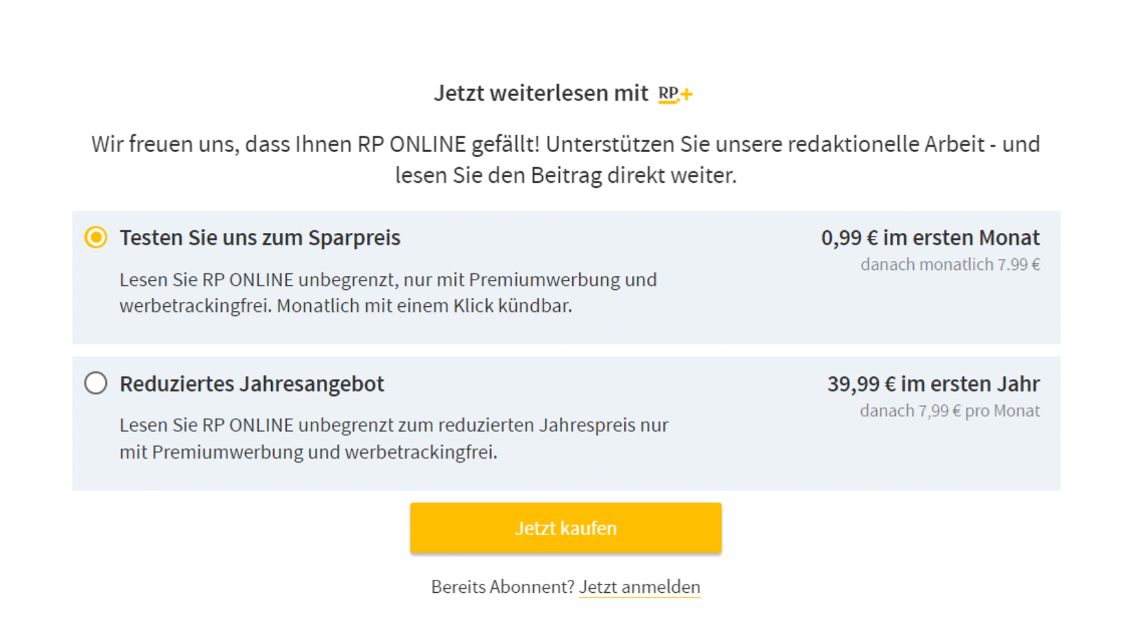
BEFORE: When RP started the experimentation process, its paywall page featured two offers (monthly and weekly).

AFTER: The redesigned page features three offers (monthly, weekly, and yearly, with the most popular in the middle), less text and a red colour that stands out from the rest of the site.